How to Make Your Lightroom Rendering Look Like Your Camera Preview

Have you ever imported an image into Lightroom and felt that it looked different than what you remember from the back of your camera? If you have, you are probably not imagining it.

There are two reasons this disparity can occur. The first is a function of our vision. The second derives from the way your camera and Lightroom handle RAW files.

Night-Adjusted Vision

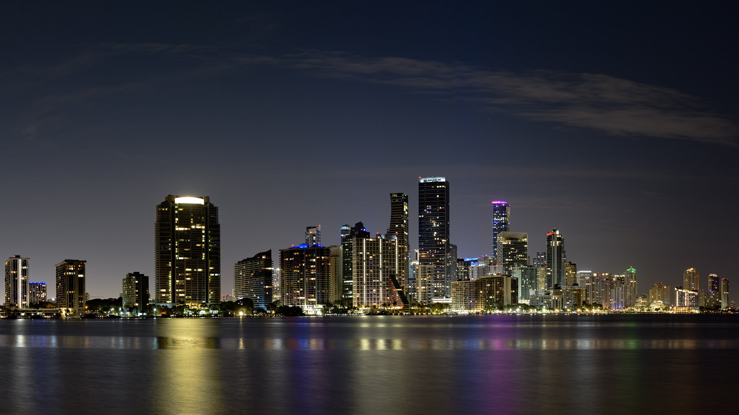
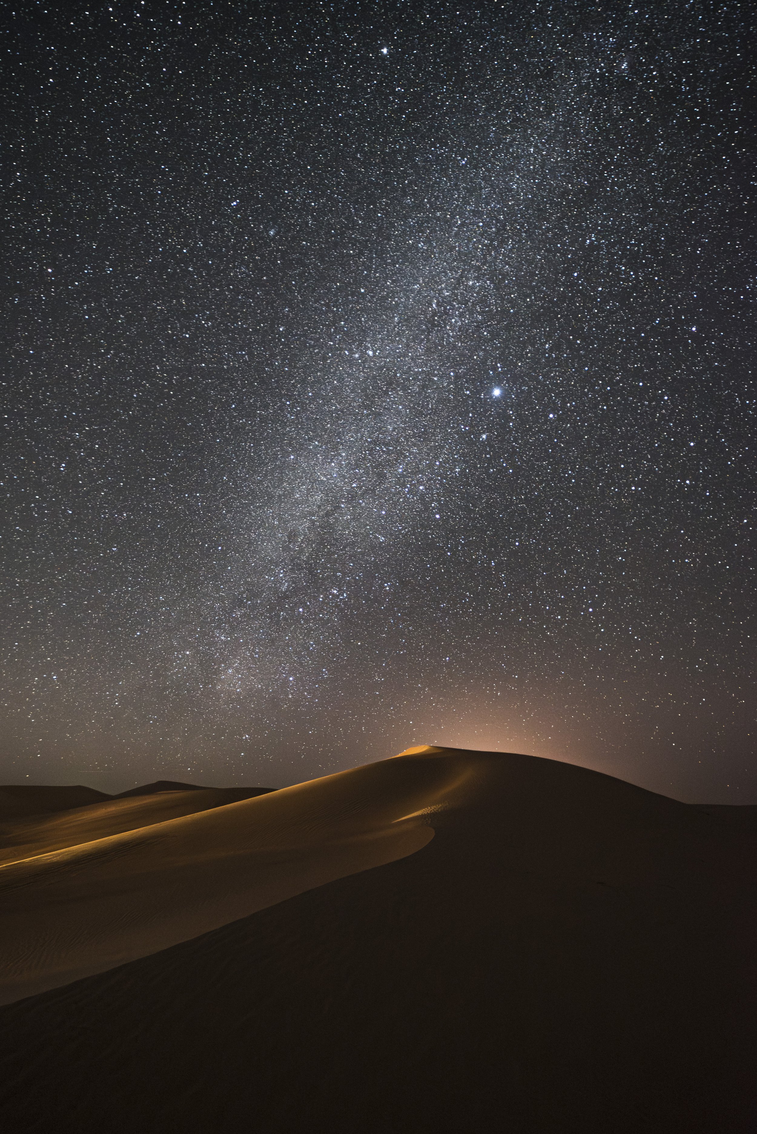
Our eyes are fabulous instruments. Their ability to adjust to a wide range of light is astonishing. Stand outside on a bright sunny day and you’re able to take in all of the information from your surroundings. Enter a dark room and your eyes adjust to the low level of luminance, allowing you to make out shapes and details. Stand on a street illuminated with city lights and you can discern every detail from the highlights of bright buildings to the shadows beside them.

However, adjusting to extreme darkness takes time. As your surroundings get darker, your pupils dilate to allow more light to enter—just like opening your lens aperture from f/8 to f/2.8. This condition is called “night-adjusted vision.”

When your eyes are dilated in this state, the images on your camera’s rear LCD will be perceived as much brighter than they actually are—because your eyes have adjusted to the darkness of the world, and not to the brightness of your camera. The problem this causes is that when you view your images in Lightroom, they look much darker than you remember from in the field.

The solution

Turn down the brightness on your camera’s LCD.

Most cameras’ default setting for brightness is Auto. This means when it’s bright outside, the screen brightens; when dark, the screen dims.

While the Auto setting is fine for most types of photography, the night photographer needs to take manual control over the brightness of the LCD. By lowering it to the lowest setting possible (or second lowest), you will get a much more accurate preview at night. This will also help achieve a better match when you review your images back in Lightroom. (Figure 1 shows the LCD brightness settings on Nikon and Canon cameras.)

Figure 1. The LCD Brightness settings in Nikon (left) and Canon menus.

How the Camera Previews

Even though you have set your camera to shoot RAW, the image you see on the rear LCD is not the RAW image, but rather a JPG generated from that RAW data. For many photographers this discrepancy is irrelevant. But for those wanting to ensure a close match from camera to Lightroom, a better understanding of this function is important.

There is a setting in your camera that allows you to create different “flavors” in your photos. Each manufacturer has different names for this setting, but in essence they all alter the color and contrast of the resulting image. For example, by using Portrait mode, the skin tones of your subjects will seem more natural. Using Neutral will lower the overall contrast and saturation. Standard provides a more traditional rendering.

Figure 2. The Nikon Picture Control menu.

Figure 2. The Nikon Picture Control menu.

For detailed explanations and a complete list of your options, consult your camera manual. Nikon calls their setting Picture Controls (Figure 2). Canon is Picture Styles. Sony is Picture Profile. Fuji is Film Simulation.

These settings are applied differently to RAW and JPG images. When you shoot in RAW, the image is captured and then passed on to an in-camera processor. Here the RAW image is “tagged” with the Picture Control. But that interpretation—those settings—are not permanently baked into the file. Think of it like a note that’s added to the file that says, “Make the image look this way when it’s opened.”

When your camera displays the image on its LCD, it first creates a JPG made from the RAW file with the Pictures Control “notes” taken into account. So what you’re seeing on the LCD is not the RAW file, but a JPG that your camera’s internal computer has rendered just for that immediate use. It has no impact on how the image will look later in Lightroom.

This is in stark contrast to how things work if you’re shooting straight to JPG, rather than shooting RAW files. When you shoot in JPG, the Picture Style is actually baked in. So if you shot on the Landscape setting, the extra contrast and saturation is a permanent addition to the file. When it comes to shooting JPG versus RAW, there are many photographic disciplines out there and each has its own version of best practices. For the night photographer, we want as much flexibility within our files as possible, so we shoot in RAW.

My personal preference is to shoot my night images in RAW on the Neutral picture style. This style is the lowest in contrast and saturation. This means when I preview my image on the camera’s LCD I am seeing a more accurate view of all the image data that the camera captured. Using something like Landscape or Vivid may fool me into thinking there is less detail in the file, which in turn may cause me to make different choices in the field.

Lightroom and RAW Files

Provided you have calibrated your monitor (something every photographer should do!), JPGs from your camera should look pretty similar in Lightroom as they did on your camera’s LCD. This is because the Picture Style from the camera has been baked in!

However, remember that RAW files are only “tagged” with this information. That note attached to the image file that says “make the image look this way when it’s opened” is not available to Lightroom because the camera manufacturers consider it proprietary information—they don’t tell Adobe how to decipher it. This means the only thing Lightroom can do is create its own version of what the image should like. What we see in Lightroom is Adobe’s interpretation of the 0s and 1s in our RAW file.

Moreover, Adobe has many interpretations that you can select from. Adobe Color is the default interpretation (or Profile) that Lightroom uses. You can see the Profile dropdown in the Develop Module at the top of the Basic Panel (Figure 3).

The Problem

And that right here is where the mismatch between the LCD and Lightroom often happens.

Let’s say you shoot a RAW image with the Picture Control of Landscape. On the camera’s LCD it will look more contrasty and more saturated—because, again, you’re seeing a JPG with that Landscape “preset” applied. But when you import that RAW file into Lightroom, you’re seeing Adobe’s interpretation of this file based on assigning the Adobe Color profile. That’s a completely different algorithm. So this will almost always look different from what you saw on the back of your camera, because the settings being applied are coming from two different recipes.

Figure 3. This image is set to the default Adobe Color profile.

Figure 4.

The Solution

Choose a profile in Lightroom that better matches your memory.

How? In Lightroom, click on the double arrow next to Profile. You will see a list of alternative profiles that Adobe offers (Figure 4). From this menu you could choose, for example, Adobe Landscape to try to approximate what you remember from the field.

(These profiles are not just for matching, however. You can choose any profile to create the look that you want. Be creative. You don’t have to match what you saw in the field—you can also match the possibilities that you see in your artist eye.)

The difference in the profiles can be seen best when looking at contrast and saturation. Adobe Vivid and Adobe Landscape are the most contrasty and saturated. Next comes Adobe Color, Standard and Portrait with varying degrees of moderate contrast and saturation. Adobe Neutral is the least contrasty and saturated. Figures 5 shows one image with several profiles applied.

Figure 5.

But there are even more options beyond those! By clicking on Browse in the list, you can access all of Adobe’s profiles. The ones with the stars appear in the Favorites list, which is the dropdown we saw in Figure 4. In Figure 6 below, you can see that all of Adobe’s standard profiles are starred.

Hovering your cursor over these profiles produces a temporary preview in the image window. I recommend previewing the different profiles to gauge their affects.

Matching to Camera

In addition to Adobe’s Standard profile, you can also access their Camera Matching profiles. These profiles attempt to match your camera’s Picture Control settings as closely as possible. While not exact, they can be accurate enough to, in golf terms, “get you on the green”—and on the blue and the red, so to speak.

And there you go. That’s the secret!

That feature right there—the Camera Matching profiles—can be one of the best tricks to get your Lightroom rendering to most closely align with what you see on the LCD. You simply pick the profile that aligns with the Picture Control you used in-camera. For example, if you shoot in Camera Neutral and then apply Lightroom’s Camera Neutral profile, that should get you a relatively accurate match.

There’s a good chance that you will use this strategy so often that you’ll want to speed up the process. If you find yourself using one or more of the Camera Matching profiles repeatedly, you can add it to the favorites list to access it more quickly. Do this by clicking on the star to the right of the Camera Matching profile. Now that profile will appear on the profile dropdown list. And if you find yourself always using the same profile, you can include it in an import preset.

Figure 6.

Figure 7. The dropdown list after I added Camera Landscape and Camera Neutral as favorites.

Figure 8.

Final Takeaways

As we’ve seen, there are a two main reasons why our images in Lightroom may not match what we saw in-field on our camera’s LCD:

  1. Our night-adjusted vision perceived the image on the LCD as brighter than it actually was. The solution here is simply to lower your camera’s LCD brightness while shooting at night.

  2. Lightroom doesn’t have the ability to the read the Picture Control (Style, Profile, Film Simulation) in our RAW files. Again the solution is simple: A quick trip to the Profile section of the Basic Panel in the Develop Module will allow you to choose a profile that better matches your memory of the image. It’s also a great way to experiment and learn!

Tim Cooper is a partner and workshop leader with National Parks at Night. Learn more techniques from his book The Magic of Light Painting, available from Peachpit.

UPCOMING WORKSHOPS FROM NATIONAL PARKS AT NIGHT

How to tell the Difference Between Planes, Satellites and Meteors

Look! Up in the sky! It's ...

Sometimes, you just want to know what kind of object is passing through your star trails or star stack. Why? Could be for any reason, but the most obvious is that in post-production you might prefer eliminating one type of streak in the sky while not eliminating another. Or, you might just be curious.

Fear not, astral observer and recordist! I will guide you in how to identify and classify plane trails, satellites and meteors.

Planes

First up! The bane of of my existence. Plane trails. (I’m just kidding. Without those wonderful airplanes, I couldn’t go to all these wonderful places!)

Plane trails are easily identified by the following characteristics:

  1. They are almost always solid lines with hashed or dotted lines on either side.

  2. They travel at a predictable rate, often spanning many frames in an exposure stack.

  3. Usually, they travel in a predictable path. But, they are not always straight! You may see course changes that curve away from the initial heading.

This example spanned six frames:

Nikon D750 with a Zeiss 15mm Distagon f/2.8 lens. Six exposures at 30 seconds, f/5.6, ISO 6400.

Want to eliminate plane trails? See “4 Ways to Remove Airplanes from Star Stacks.

Satellites

Satellites are even more fun to identify, and tricksy like Hobbitses. You may want to think they are meteors, but they aren’t! Here’s what to look for:

  1. Satellites are very thin and often dim paths with no other markings alongside.

  2. In my experience, they move slower than planes, and so they also can span more than one frame in a star stack.

  3. The trails from satellites are solid lines that are the same brightness from one end point to the other. They do not taper in and out like a meteor (keep on reading for details).

This example spanned ten frames:

Nikon D750 with a Zeiss 15mm Distagon f/2.8 lens. Ten exposures at 30 seconds, f/5.6, ISO 6400.

If you want to know with certainty (or get notifications) when a satellite or the International Space Station is passing overhead, there are a ton of apps for that. See this article from Space.com for a couple of suggestions. Lance uses Sky Guide (iOS only) with great success.

Meteors

Meteors are the “holy grail,” right? We all want some meteor love in our frames. Here is how you discern meteors from the other sky objects mentioned above:

  1. Meteors taper in from nothing or a very thin path at the start point and taper out again at the end of the path.

  2. They move faster than planes and satellites, and thus often appear in only one frame, possibly two (depending on your exposure length).

  3. They can be many different colors, depending on if they flare up during entry.

  4. They almost always appear in only one frame, because they move fast and burn out quick!

Here’s an example of a whole bunch of meteors at Great Sand Dunes National Park, shot during the Perseids:

Great Sand Dunes National Park, Colorado. Nikon D750, 15mm Zeiss Distagon f/2.8 lens. 234 images at 22 seconds, f/2.8, ISO 6400, plus a single exposure at 382 seconds, ISO 2000 for the landscape after moonrise.

Iridium Flares

Bonus! There’s something else those night streaks might be. Iridium flares.

Iridi-what, you might ask? Yeah, I kinda asked the same thing when Gabe and Lance mentioned them to me while looking at the photos I pulled for this post.

Iridium flares are the reflections from a certain set of communication satellites with highly reflective antennae. When they line up properly with sunlight streaming past Earth, they glow while traveling through the night sky for up to 20 seconds.

In a photo, they look much like a meteor—a long, bright streak with tapered ends. But because they last much longer than a meteor, their trails can appear longer, and can even last through multiple frames (as in the stacked image above—you can see the gap from when the shutter was closed). Here’s another example:

Nikon D750 with a Zeiss 15mm Distagon f/2.8 lens. Two exposures at 30 seconds, f/5.6, ISO 6400.

Alas, as cool as these can be to shoot, they won’t be shooting through our skies much longer. Iridium, the company that put them up there, is taking them down. For more info, see their brilliantly titled “#Flarewell” webpage.

Wrapping Up

Now that you know which is which, I hope deciding which to eliminate or enhance will become easier during your post-processing.

Stump the Chump

Got a mystery? Post your photo (either in high resolution or cropped close to the object) in the comments section or on our Facebook page and I’ll help you identify it. I’m looking forward to sleuthing out some mysterious sky events with you.

Matt Hill is a partner and workshop leader with National Parks at Night. See more about his photography, art, workshops and writing at MattHillArt.com. Follow Matt on Twitter Instagram Facebook.

UPCOMING WORKSHOPS FROM NATIONAL PARKS AT NIGHT

Five Questions: Light Painting Headlights, Moonrises and Sunsets, Auroras and More

You ask questions, we give answers. (When we’re not shooting. Which is why we don’t do this feature more often.)

This installment of our “Five Questions” series features inquiries about light painting headlights, tripods, open hours for national parks, moonrises at sunset and lens choices for aurora.

If you have any questions you would like to throw our way, please contact us anytime. Questions could be about gear, national parks or other photo locations, post-processing techniques, field etiquette, or anything else related to night photography. #SeizeTheNight!

1. Light Painting Headlights

Pickup in Nelson Ghost Town, Nevada. © Tim Cooper. Nikon D4, Nikon 24-70mm f/2.8 lens. 3 minutes, f/8, ISO 100.

Q: When light painting old cars/trucks at night, how do you get the headlights to look like they are on? I have an old tractor in a field that I would like to practice on. — Brien R.

A: We love light painting, especially old cars! Who doesn’t?

Light painting the headlights is a tricky but rewarding thing to practice.

If the headlights have the glass still intact, use a very low-power light source (e.g., a Maglite or a Coast G5). Stand about 2 to 3 feet from the headlight, but to the side so you aren’t blocking the camera. Shine the flashlight into the headlight briefly—1 to 3 seconds is generally enough. Then walk over to the next headlight and do the same.

Here’s a key to this working: Stay invisible. Be careful and use your body to block the light source (i.e., the bulb) from being seen by the camera—we want to capture only the light reflecting from the headlights. I also advise dressing all in black, including black gloves. Sometimes the light bouncing off the headlights can freeze your hand or face in the frame, and you end up being ghosted in the picture. If that is the case, you’ll need to move farther out of the scene and then snoot your flashlight with a long tube— think PVC or a paper towel core. This will give you a more precise paintbrush to place the light.

Finally practice, practice, practice! And then feel free to share your results with us. — Gabriel

2. Lance’s Tripod

Q: I’m trying to figure out which tripod Lance showed in your CreativeLive class. I went back and watched the class again and figured out that it may be a Manfrotto 190 carbon fiber with a leveling center column. Can you please confirm this? Also, for a tripod this size would you still suggest that setup or has something else come out that you like better? Finally, which ball head would you suggest for this combo? — Marc S.

A: You are correct that I was using the Manfrotto 190 with a leveling head in the video. The head is great, but only for panoramas. It’s unnecessary otherwise.

If I were to buy today, I’d go with the Manfrotto 190go! Carbon Fiber M-Series Tripod with MHXP RO-BHQ2 XPRO Ball Head RC2 Kit. I like the twist locks better than the flip locks, which can pinch if you are not careful. However, these days I’m mostly using my Gitzo Series 2 Traveler Carbon Fiber Tripod with Center Ball Head.

Several of us at National Parks at Night are big fans of the Acratech GP-ss Ballhead With Lever Clamp. It is designed for compact travel tripods. It’s not quite as compact as the Gitzo head, but is easier to work with and the lever clamp is awesome. — Lance

3. Hours at National Parks and Monuments

Arch Rock, Valley of Fire. © 2014 Matt Hill. Nikon D750, Nikon 14-24mm f/2.8 lens at 14mm. 30 seconds, f/2.8, ISO 500.

Q: Thank you for your recent article on whether light painting is allowed in national parks. However, it seems there is an even more important issue, which is if visitors are actually allowed to enter certain parks at night. My wife and I visited a number of national parks and monuments in recent years, but in places like Valley of Fire, Hovenweep or National Bridges we were told by rangers that we’d be in trouble if we were seen out there at night. On the other hand I have seen plenty of photos taken by the National Parks at Night team or other professionals at exactly these places. Are there different rules for the average photographer? — Lambert

A: Most of the 400-plus National Park Service units are open 24 hours to all visitors—including Natural Bridges National Monument, so I’m not sure why that ranger told you otherwise. In fact, night skies are part of how Natural Bridges actively entices people to visit. It’s also a feature that Hovenweep plays up, though only some sections of the park are open at night.

All of the national parks are open 24 hours per day, except Petrified Forest, but you can get a camping permit to stay overnight, or pay for a Special Use Permit to shoot after hours. Some of the national seashores are closed at night unless you have a camping or special use permit. National wildlife refuges are mostly closed at night, but those are units of U.S. Fish and Wildlife, not the NPS.

The Oliver Cabin is one of the many wonderful night photography subjects in Great Smoky Mountains National Parks’ Cades Cove region. Cades Cove is closed to vehicles at night, but you can walk or bike the 11-mile loop road all night if you’d like. © 2017 Chris Nicholson. Nikon D3s, 17-35mm f/2.8 lens, light painted with a Coast HP7R flashlight. 30 seconds, f/5.6, ISO 3200.

However, note that even if a park is open at night, there’s a chance that certain features are closed. In addition to Hovenweep, this is also the case at Mesa Verde National Park, which closes access to the ruins after sundown. Another example is Great Smoky Mountains National Park (where we’re hosting a workshop this April): Cades Cove, an amazing place to shoot; it is closed to motor vehicles at night, yet remains open to foot traffic.

As for Valley of Fire, that’s a state park, and as with any state land is run under local regulations that the NPS guidelines don’t affect. For night access to Valley of Fire, you need either a permit or to be camping in the park. (Or you to be on our workshop this April, which happens to have one spot remaining.)

No matter where you’re going to shoot at night, we always recommend checking the hours and letting the rangers (or other appropriate authorities) know what you’ll be up to. Not because you necessarily need permission to engage in night photography on public lands, but because it sometimes makes their jobs easier if they know you’ll be out there. Not to mention that they might share some valuable local knowledge about the location. — Chris

4. Aurora Lenses

Aurora over Westfjords, Iceland. © 2012 Lance Keimig. Canon 5D Mark II, Nikon 20mm f/3.5 lens. 15 seconds, f/5.6 ISO 3200.

Q: I’ll be traveling to Iceland in March to shoot auroras. Which lens would you recommend between a Sigma 20mm f/1.4 and a Sigma 14mm f/1.8? Or is there another lens you’d recommend instead? I’m shooting with a Sony a7R III. — Jeff

A: Congrats on your Iceland trip! Our No. 1 bit of advice is to get off of the main ring road and explore the random back roads to avoid the crowds. It can be busy over there!

As for your lens question, the wider-aperture model will probably be more useful, but it’s always good to have options. If the sky really lights up, you’ll want the widest lens you can get, but the 14mm is crazy wide for general shooting. Also, you don’t necessarily need superfast lenses—with a good aurora, you will probably be stopping down a few stops anyway.

For more advice on shooting the northern lights, see our two blog posts “Capturing Clouds of Light: How to Photograph the Aurora Borealis.” and “Northern Exposure: 8 Illuminating tips for Photographing Auroras.” — Lance

5. Moonrises at Sunset

Day before full moon, Death Valley National Park. © 2005 Tim Cooper. Canon 1Ds, 16-35mm lens at 31mm. 4 seconds, f/8, ISO 100.

Q: We learned from PhotoPills that sunsets can be spectacular when the moonrise and sunset occur within an hour of each other. But the moon rises in the east and the sun sets in the west, so we’re stumped. Any ideas? — Barbara E.

A: I suggesting thinking about it this way: What will be illuminated from the west when you’re facing east, with a great view of the moon rising behind it? The idea isn’t to shoot the sun and moon together, but rather to shoot the full moon rising among beautifully sunlit scenery or among the delicate light of a just-set sun.

The other advantage to this scenario is that the brightness of sunset balances well with the moon, which equalizes the intensities to get it all in one shot (as opposed to having to HDR the scene, which is so often the need when trying to shoot the moon over a landscape).

For a crispy moon, keep those exposure times short—don’t be afraid to ramp up your ISO to keep things sharp. Ideally, you want a big ol’ moon coming just off the horizon with gentle, ruddy sunlight kissing your subjects.

Grab your phone and scout with PhotoPills! Use it to see just where that moon will peek up to be sure you will see it during that sweet spot of sunset with the moon on the horizon.

And please send us photos of your success! — Matt

Chris Nicholson is a partner and workshop leader with National Parks at Night, and author of Photographing National Parks (Sidelight Books, 2015). Learn more about national parks as photography destinations, subscribe to Chris' free e-newsletter, and more at www.PhotographingNationalParks.com.

UPCOMING WORKSHOPS FROM NATIONAL PARKS AT NIGHT

How I Got the Shot: Lighthouse Beams at Fire Island

Fire Island Lighthouse. Nikon D750, Irix 15mm f/2.4 lens. Nine exposures at 1/2 second, f/2.4, ISO 6400.

The Location

Lighthouses are the great sentinels of the sea and their true souls shine at night.

The northeast U.S. has some of the most famous lighthouses in the country. They’re mostly in New England, but here in New York we have a couple of noteworthy examples too, including the amazing Fire Island Lighthouse at the western end of Fire Island National Seashore.

We shot here a few times last fall, including twice with attendees of our New York Night Photography Summit. I created the above image on one of those nights.

Well, perhaps I should say I created this image partly on one of those nights, and partly at my desk at home—because this technique involves a fair amount of post-processing, which is what this installment of How I Got (er … processed) the Shot is all about.

The Shoot

The Fire Island Lighthouse has a rotating beam. When a lighthouse has a rotating light it gives us more opportunities to depict the beams at different widths, depending upon the length of our exposure—i.e., a longer exposure will capture more of the beam as it moves, thereby making the beam appear wider in the image.

So the first thing to consider is shutter speeds. For the Fire Island Lighthouse I experimented with everything from 1/4 to 4 seconds. The 1/4 exposures resulted in very narrow beams of light; the 1/2 exposures were obviously wider, and also (naturally) resulted in fewer beams to stack in post, and both those trends continued as the shutter speeds got longer. Each exposure generates a different interpretation of the lighthouse, so I always suggest exploring your shutter speeds first so you can figure out what works best for you.

You can see in my test shots how the width of the rotating lighthouse beam changes with longer shutter speeds. In these examples, 1/8 resulted in the narrowest beam, 1 second in the widest.

Once I settled on 1/2 as my favorite shutter speed, that determined my aperture and ISO. Of course, shorter shutter speeds at night generally mean you need to push the envelope on the other aspects of the exposure triangle—shooting with a wide-open aperture (f/2.8 or wider) and a higher ISO (3200 to 6400). These combinations will generally allow you to capture bright beams of light as well as adequate detail in the lighthouse structure and the foreground.

Another image of the Fire Island Lighthouse from the same night. This one is composed of 1/4-second exposures, which resulted in the narrower beams of light. Nikon D750, Irix 15mm f/2.4 lens. 20 stacked frames shot at 1/4, f/2.4, ISO 6400.

Once I was happy with my exposure—i.e., beams that are bright but not blown out—I set my camera to burst mode. To prevent camera shake, I used a cable release (the Vello Shutterboss II) to fire the shutter. I kept my finger on the remote’s trigger until the beams did a full rotation around the lighthouse. (If you need to take another longer shot for more detail in the foreground, you can do that as well.)

Once I captured the assets, I was able to blend them in Lightroom and Photoshop to get that multiple-beam effect.

The Processing

Processing all of those raw images together into the final version is not terribly complicated, but involves a few steps and some finessing. So we’ve put together this video to show how I brought the photograph to completion.

In the video I talk about everything from the planning to the execution to how to put it all together in post.

Wrapping Up

If you live near or are planning to visit a rotating-beam lighthouse for night photography, we highly recommend giving this a go. It’s a fun technique that can generate some very dynamic images.

When you do, please share your work! We’d love to see your photos in the comments section below or on our Facebook page.

Note: Did you like that video, and think you’ll like more? Consider subscribing to the National Parks at Night YouTube channel to get notified about all our new videos when they come out.

Gabriel Biderman is a partner and workshop leader with National Parks at Night. He is a Brooklyn-based fine art and travel photographer, and author of Night Photography: From Snapshots to Great Shots (Peachpit, 2014). During the daytime hours you'll often find Gabe at one of many photo events around the world working for B&H Photo’s road marketing team. See his portfolio and workshop lineup at www.ruinism.com.

UPCOMING WORKSHOPS FROM NATIONAL PARKS AT NIGHT