To Contrast or Complement: How to Use Color in Light Painting

Color and Color Photography

I’ve always thought that if you are going to be a color photographer, then you should understand color.

At least that’s what I thought after I learned about color. For the first several years of my photography career I was regrettably ignorant to the importance and impact of the colors we use in our images. I’ve come to find out this is not at all uncommon. Many photographers who produce color images are as equally unaware of color’s characteristics.

I can hear the naysayers already. What color? There is very little color at night. True. Sort of. While there is not an abundance of natural color at night, we do have the opportunity to add our own, with light painting. And we can do that with greater effect if we understand and use the concepts of how the color of light affects perception.

Color psychology

Whether we know it or not, color has a big impact on our lives. From the color of our house to the clothes we wear, color is a quiet indicator of who we are and what we like. You look great in that color, are you a Summer? I am a Winter.

We use it to help fit our mood, or even to enhance it. It may determine the car we drive off the lot or the image of ourselves we want to project. With this level of integration with our daily lives, it’s amazing we don’t give color a higher priority in our image-making processes. We tend to think the color that’s present (in the words of the kids these days) is what is.

pencils.jpg

There’s been barrels of ink written about how we respond emotionally to color, especially when it comes to marketing. We see orange as cheerful, red as exciting, green as peaceful and blue as trustworthy. While there may be grains of truth in this, our personal experiences, not to mention the context the color is being used, render these classifications as no more than points of interest when it comes to photography.

For example, blue may project “trustworthiness” in a logo, but that’s not the word that comes to mind when viewing a night sky. The green of the forest can be perceived as relaxing, but may not have the same effect when projected onto a night scene with a flashlight.

While I think color psychology is interesting, I believe its connection to photography is minimal. When you take a picture of an orange, your viewer is more likely to think of a citrus slice or juice rather than an active emotional state.

What I do believe is important for the photographer, however, is color dissonance and color harmony. These terms describe the effect of pairs or groupings of color.

Color Dissonance

Color dissonance can be loosely described as a color scheme that uses complementary colors, which are ones that are opposite of each other on the color wheel. In Figures 1 through 3 you can see the color wheel used for light (Additive Color Model). With this model, the primary colors are red, green and blue (RGB—sound familiar?); the respective secondary colors are cyan, magenta and yellow.

Figure 1. Additive color wheel.

Figure 2. Primary and secondary colors.

Figure 3. The complementary colors of yellow and blue.

When using complementary colors together, you are creating a color scheme that is punchy. It decreases color unity and increases color contrast.

Color Harmony

Color harmony can be loosely described as a color scheme that uses analogous colors. These are colors that are near to each other on the color wheel. Figure 4 shows the analogous colors of yellow, orange and red.

Figure 4. Analogous colors.


When using analogous colors together, you are creating a color scheme that is less punchy. It increases color unity and decreases color contrast.

Strategies for Using Color

You’ll hear that warm colors such as yellow, orange and red are more active, more exciting—and that cooler colors such purple, blue and green are somewhat calming, less active. I believe there is something to that. However, night photographers rarely think of changing the entire color cast of an image to project a feeling. What’s more likely is that we’ll find ourselves in either a warm-color or cool-color situation in the field. For example, we may be shooting in the warmer light of a city (Figure 5), or in the cooler conditions of a wilderness landscape where light pollution is not present (Figure 6).

Figure 5. The warmer colors of an urban environment. Washington, D.C. Nikon D700 with Nikon 35mm f/2 lens. 30 seconds, f/16, ISO 200.

Figure 6. Cooler colors found in the absence of artificial light. Glacier National Park. Nikon D4s with a Nikon 14-24mm f/2.8 lens. 30 seconds, f/9, ISO 3200.

It’s within these common situations that we can begin to consider color, and to perhaps even create a color strategy. Sometimes we can affect the overall color dissonance or harmony, sometimes we can’t, but it’s good to know the effects of both approaches so that we can use them creatively when possible.

Figure 7 demonstrates the familiar contrast between the cool night sky and the warmth of artificial lights, and is a perfect example of how we don’t always have the ability to control the color contrast in the scene. If I had changed the white balance to try to change one color cast, that would have affected the other color cast too. In a scene like this, we are stuck with the naturally occurring color contrast.

Figure 7. Cool night sky with warm artificial lights. San Francisco. Canon EOS-1Ds with a Sigma 70-200mm f/2.8 lens. 20 seconds, f/16, ISO 100.

Other situations, however, may provide us with more power to control the overall effect of color—in particular, when we are adding our own light to the scene.

For the image in Figure 8, I chose to light paint a pale blue truck with an unfiltered Coast HP5R flashlight. I shot this image on a full-moon night with the camera’s white balance set to 4000 K. The cooler white balance kept the sky looking more blue (a warmer white balance of Daylight/Direct Sun/5500 K would have rendered the sky somewhat colorless). This cooler white balance also influenced the color of the flashlight. Here, the HP5R (like many other LED flashlights) has a slight blue cast. The cooler white balance, then, has pushed the color of my flashlight even more blue. Couple that with the blue sky and you get classic color harmony.

Figure 8. Influencing the scene toward color harmony. Nelson Ghost Town, Nevada. Nikon D4 with a Nikon 35mm f/2 lens, light painted with a Coast HP5R flashlight. 4 minutes, f/9, ISO 100.

Compare Figures 7 and 8. In Figure 7 we are seeing color contrast (dissonance), and in Figure 8, color harmony. While looking at each, notice how your eye moves. The movement is more abrupt with color contrast and a bit less when there’s color harmony.

So when you consider the possible changes you can make to color in a scene, consider dissonance versus harmony. Simply put, do you want to create an image that’s visually active and has punch (more color contrast—dissonance) or an image that is tranquil (less contrast—color harmony)?

The trick is to decide where you want the viewer to focus. If the colors are really punchy, the viewer may pay more attention to the difference in color. If the colors are similar to one another, the imaginary line drawn between the colors may be less apparent. There is no right or wrong. It’s just a matter of how you want people to move through your photograph and where you want their focus to be. That decision can be directed by your personal style, or by the subject matter.

Let’s look at a couple of case studies.

Color Dissonance

Figure 9 is an image I made at Battery Spencer on our 2019 San Francisco workshop. It was an exciting night due to the dense fog rolling in from the sea. The fog was glowing with the dominant color of the city’s sodium vapor lights.

In most circumstances I would have lowered the Kelvin temperature on my camera to neutralize this heavy orange cast. In this case I decided to stick with a Direct Sun (5500 K) white balance setting to render the city light as it was. This gave the ambient scene an otherworldly sort of look.

Then I added in my light painting. With the camera’s white balance set to Direct Sun, I knew my Coast HP7R would render as neutral, tending toward blue. But I wanted more color dissonance—more action, more excitement created by color contrast. So I put a pale blue gel over the flashlight to push the color further toward blue.

The result? A blue spotlight creating a star through the orange fog that highlights a silhouette. Color contrast. Color dissonance.

Figure 9. Creating color contrast. San Francisco. Nikon Z 6 with a Nikon Z 24-70mm f/4 lens, light painted with a Coast HP7R flashlight. 15 seconds, f/4, ISO 800.

Color Harmony

For the image in Figure 10, I went for the complete opposite: color unity. I made this at Grafton Ghost town during our Zion National Park workshop in 2016. I wanted to create a cool color harmony that would provoke a somewhat spooky feeling.

The landscape was being illuminated by a full moon. I set my white balance to 4000 K. Images made under a full moon can often look like they were shot in daylight, so lowering the white balance to 4000 K helps keep the impression of a night scene.

A setting of 4000 K renders my Coast HP5R only somewhat blue, and again I wanted more blue, to match the coolness of the ambient light. So I added a light blue gel to the front of the flashlight to increase the depth of blue, which helped retain color harmony throughout the image.

Figure 10. Creating color harmony. Grafton Ghost Town, Utah. Nikon D700 with a Nikon 24mm f/2.8 lens, light painted with a Coast HP5R flashlight. 1 minute, f/9, ISO 200.

Pulling it All Together

Color is an important feature in all of our imagery, day or night. While we don’t always have control over the color in a scene, given the opportunity, we should influence it to the best of our ability.

Here are the key considerations to choosing the color of your light painting in the field:

  1. White balance influences the overall color cast. This means it will affect all colors equally. Set the white balance to anchor the color of your ambient light (sky, fog, moonlight, etc.). This step should be done first, as it sets the stage for any color you may add into the scene.

  2. Consider the color of your flashlight or light panel and how your white balance will affect its color.

  3. Consider how you want your viewer to see the image. Should their eyes bounce back and forth between illuminated subjects (dissonance) or should they move gently through the image (harmony)?

  4. Alter the color of your light painting tool to affect either dissonance or harmony. In the case of a Luxli Cello or Viola, you can simply dial in the color temperature to contrast or unite the colors of the scene. If you are using a flashlight, first determine its actual color (see earlier blog posts on correcting the color of your flashlight), then alter the color of the light by using gels.

Wrapping Up

The next time you’re light painting, keep in mind the concepts of color contrast and color harmony. Then experiment with each to create different images with different kinds of impact. This exercise will create an expertise in applying these concepts to great affect, guaranteeing that you’ll level up your night photography.

We’d love to see what you do! Post your images in the comments, share on our Facebook page, or tag us (@nationalparksatnight) on Instagram.

Tim Cooper is a partner and workshop leader with National Parks at Night. Learn more techniques from his book The Magic of Light Painting, available from Peachpit.

UPCOMING WORKSHOPS FROM NATIONAL PARKS AT NIGHT

Keeping Our Galaxy Real: How Not To Overprocess the Milky Way

Note: This post concludes with a video of Gabe walking through how to process a realistic-looking Milky Way. Want to jump straight to that? Click here.


Do you remember the first time you saw the Milky Way?

So few of us have access to starry skies that the wow factor was undoubtedly very high. What you saw on the back of your camera and then on your monitor was even more exciting, and in this excitement you probably pushed your post-processing to bring out the stars just a bit more … and just a bit more … and just a bit more … and. …

This is a very normal and common experience. However, taken too far, it also detracts from reality—many of the night images we see online simply do not reflect what the Milky Way actually looks like.

In this post, I aim to help you process your Milky Way shots in a more natural and realistic way.

Milky Way panorama. Nikon D750 with a Nikon 14-24mm f/2.8 lens at 14mm. Seven stitched frames shot at 30 seconds, f/4, ISO 6400.

Star Witnesses

If you search the 3 million images tagged #milkyway on Instagram, you’ll notice that over 80 percent of them are overprocessed.

What do I mean by that? In those images, the Milky Way looks very unrealistic—too contrasty, over-sharpened and full of colors that jump out at you. In short, it looks like no Milky Way we have ever seen in the actual sky.

Yet the likes and positive comments pile on! Why is this?

The general public is still unfamiliar with what the Milky Way really looks like. Their only experience with it is what they see online. The Milky Way still has a high wow factor, and as technology and post-processing techniques become more powerful, photographers can eke out all sorts of additional detail. The problem is that so many eke out every detail.

We want to bring a realistic vision back to the Milky Way. The Milky Way should be the chorus to your song, but all good songs have a gradual build: highs and lows that build to that chorus. A good photograph should guide us throughout the whole image with a similar tempo.

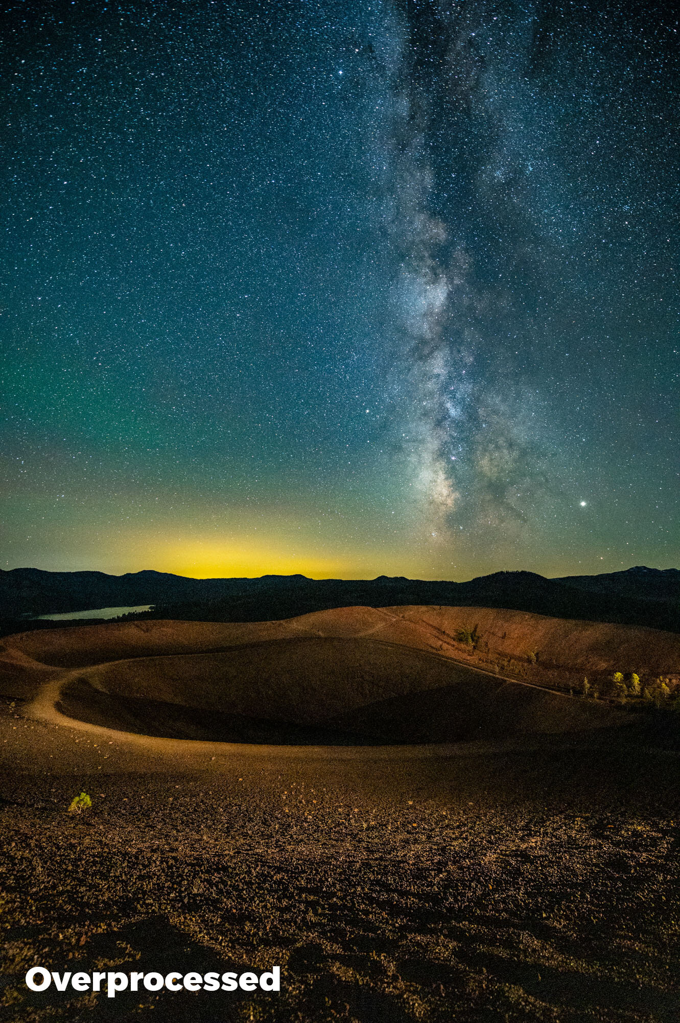
Below is an example of a Milky Way image that is processed naturally versus one overprocessed in a way that’s commonly seen on the web. Note that in the overprocessed version the tonal range is not as smooth, the colors are too punchy, and there is very little separation between the Milky Way and the stars that surround it.

The left version might look "wow," but the right is closer to what the Milky Way actually looks like. Nikon Z 6 with a Nikon 14-24mm f/2.8 lens at 14mm. 15 seconds, f/2.8, ISO 12,800.

Avoiding Overprocessing

Most overprocessing pitfalls can be rectified by fewer global adjustments and more local adjustments. I know the global tools in Lightroom’s Basic module are right there and ready to use. But the astro-landscape photo is made of two different elements of exposure: the sky and the landscape. They often require different considerations on how to process them.

Globally applying Dehaze because it will successfully enhance your sky could very well have an adverse effect on the colors and shadows of your foreground. Unless your foreground is a silhouette, it’s best to think of your Milky Way image as two images and process them accordingly with local brushes and gradients.

If you are working under dark skies with little to no moonlight, you might even consider shooting two images: one correctly exposed for the stars and another longer exposure that reveals detail in the foreground. (I covered this type of blending of two images in my previous blog and video about Starry Landscape Stacker.)

An example of a blended image. First I shot a lower-ISO long exposure during civil twilight for the foreground, then a higher-ISO sharp-star exposure for the background, and layered the two in post-production. Being able to process the foreground and background separately allowed me to maintain a more realistic Milky Way. Hasselblad X1D with a Hasselblad 30mm f/3.5 lens. Foreground: 6 minutes, f/4, ISO 800; background: 23 seconds, f/4, ISO 6400.

Presence Sliders in Lightroom

Texture, Clarity and Dehaze are very attractive tools, as they can increase local contrast in a scene and really make an image pop. However, overusing them can lead to crushed shadows and unwanted shifts in color (as seen in the blog post linked above).

Think of these three adjustments as coming with great responsibility. To understand what they do, crank them to 100 percent, then slowly bring them back, and toggle between your full view and 100 percent to see how they fundamentally affect your image. Then when processing, use them judiciously.

presence.jpg
  • Texture

The newest filter in Lightroom (and the one I am most enamored by) increases sharpness without amplified grain or saturation. However, when overused, every star is sharpened and jumps out in the sky. This can compete too much with the Milky Way as well as falsely make every star look as bright as the next.

Depending on the scene, I like to add 3 to 8 points of Texture to my Milky Way by using a brush to add the effect locally. If I go above 10 on Texture, I really need to examine the effect at 100 percent zoom to make sure I’m not overdoing it. (However, that threshold applies only to the sky. If I have a well-lit rocky landscape, Texture is just what the doctor ordered to enhance the granularity of those rocks—for that I might use anywhere between 20 and 60 points.)

  • Clarity

I often use Clarity in lieu of the Contrast slider. I’ll adjust my white and black points first. Then, if the Milky Way needs more punch, I’ll slide Clarity to anywhere from 5 to 25. However, I always keep an eye on the top corners of my image, as Clarity quickly heightens any vignetting and can make smooth graduations in the sky seem choppy.

  • Dehaze

Brings contrast and saturation to an image. The former is great for boosting the low contrast that is often found in night skies. But keep an eye on that saturation—that’s where blues get wonky real quick. I never apply Dehaze globally; I typically apply it only via the Graduated Filter tool. My Dehaze adjustments can vary depending on the scene, but they usually range between 10 and 30.

It is also very important when you are combining global and local adjustments to remember that they build on top of each other. If you’re not precise in your workflow, you might get stuck fighting back and forth between how your global and local adjustments overlap and affect each other, sending you down the road of overprocessing. To avoid this, hone your global adjustments first, and only then start with the local changes to your Milky Way.

Another important thing to keep in mind is that our editing tools grow and change over time. I love Texture, but just a few years ago that tool wasn’t even in my imagination. It didn’t exist until about this time last year! Be sure to always keep a lookout for innovations in Lightroom that you can use to make your images better and better.

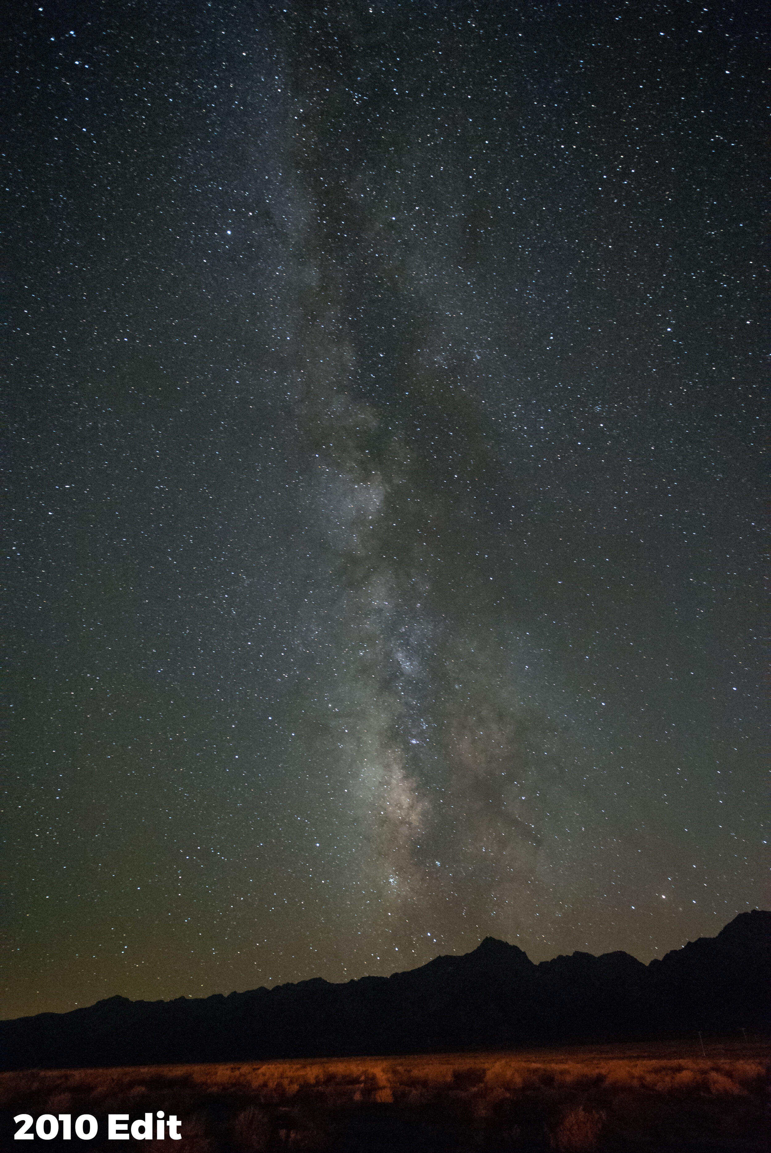
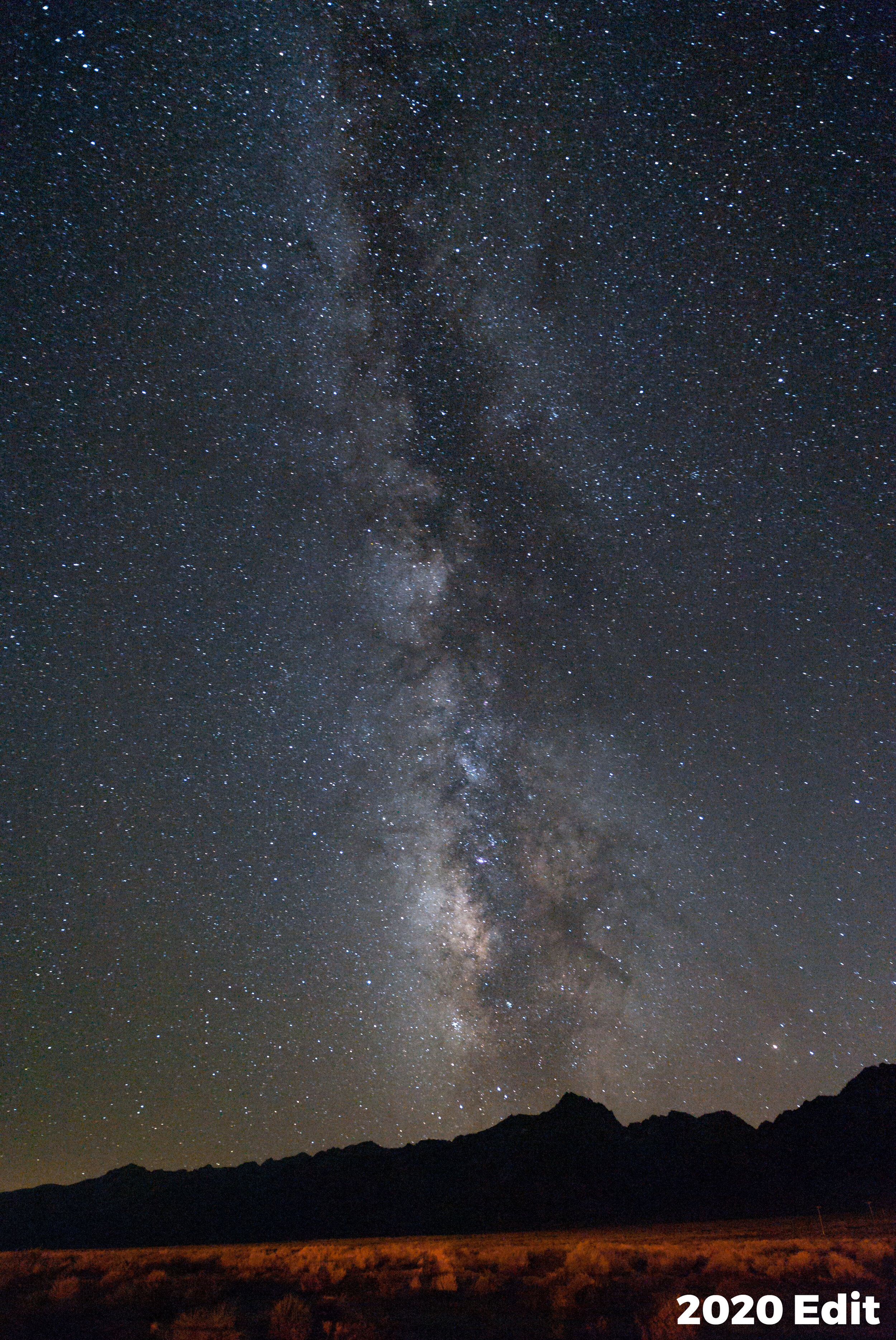
For example, I recently revisited the very first successful Milky Way image I’d ever shot. I hadn’t overprocessed then, but I had processed it with Lightroom 3 (below, left). That was a great program for its time, but it had some limitations compared to what’s on my computer today. Now, using Lightroom Classic 2020 (below, right), I get some finer detail out of the file.

Shot in 2010 with a Nikon D700 with a Zeiss 21mm f/2.8 lens at 30 seconds, f/4, ISO 6400. Left: Processed in Lightroom 3 with +12 Clarity, +11 Vibrance and +20 Luminance Noise Reduction. Right: Processed in Lightroom Classic 2020 with more subtle local adjustments, less noise reduction and more magenta.

Putting it All Together

I made this video that walks through my considerations for processing the Milky Way in a more natural way. I point out the sliders that we might slip too far on, and I share my Milky Way brush technique for subtly bringing out the finer details.

Now, if you’re one of the overprocessing culprits … First, know that you have a lot of company. But second, know there’s a better way, and we’re happy to help.

Stop processing the Milky Way with a hammer and a bucket of paint, and then share your images with us below in the comments. Or, better yet, share them online on Facebook or Instagram! Tag @nationalparksatnight and let’s educate the world on what the natural Milky Way really looks like!

Gabriel Biderman is a partner and workshop leader with National Parks at Night. He is a Brooklyn-based fine art and travel photographer, and author of Night Photography: From Snapshots to Great Shots (Peachpit, 2014). During the daytime hours you'll often find Gabe at one of many photo events around the world working for B&H Photo’s road marketing team. See his portfolio and workshop lineup at www.ruinism.com.

UPCOMING WORKSHOPS FROM NATIONAL PARKS AT NIGHT

Shooting Downtown After Sundown—Light Painting in the Urban Environment

Light painting in an urban environment can be quite a different experience if you are primarily accustomed to working in natural landscapes. For example:

  • Moonlit landscapes are probably the easiest situations for light painting. You can work with any combination of exposure variables. There’s no pressure to get the lighting done quickly, so there is usually plenty of time to develop and execute a plan to get the shot. The working conditions are relatively constant, and the ambient light is easy to deal with.

  • Light painting in astro-landscape conditions is often addressed with Low-level Landscape Lighting (LLL), which involves using a very dim continuous light source (or sources) in a fixed position. LLL eliminates the pressure of scrambling to fully light a scene in the short 15- to 30-second exposure time required to keep stars as points of light. Many light painting tools are too bright to effectively control when working with high ISOs, wide apertures and relatively short shutter speeds. Still, the approach is often straight-forward.

On the other hand, light painting in urban or artificially lit environments presents a couple of different challenges from light painting a natural landscape. The first is extreme scene dynamic range or contrast, and the second is the potential for wildly varying color temperatures of existing light sources. But both of those challenges also can be part of what makes urban night photography and light painting rewarding, as I will show in the following examples.

Figure 1. Plymouth Waterfront. To expose properly for this image, I had to use less exposure than I would have liked to avoid clipping the highlights in the background. This left the wall in the foreground severely underexposed, and thus ripe for light painting. Nikon D750 with a Nikon 24-120mm f/4 lens at 55mm, light painted with a Coast HP7R flashlight. 30 seconds, f/8, ISO 140.

In Figure 1, the Plymouth waterfront scene was illuminated primarily by high pressure sodium vapor lights, supplemented by a metal halide light on the building in the background. I had to underexpose the image to keep the background structure from blowing out, which left the wall of the foreground building in deep shadow. My strategy was to expose for the most important highlights and allow the rest of the exposure to fall into place.

It was a perfect opportunity to use light painting to fill in the underexposed shadows. I scraped the light from a Coast HP7R along the edge of the building, from out of the frame to camera left. This brought out the texture of the wall and the ivy.

The choice of a (more or less) daylight white-balanced LED flashlight contrasted with the very warm sodium light that illuminated the foreground, middleground and tree. The combination of both the angle and color of the added light provided depth and another layer of texture to the otherwise ordinary scene. Mundane subject matter can be made much more interesting with effective lighting.

Figure 2. Burial Hill Cemetery. Located in downtown Plymouth, Massachusetts, the cemetery is the final resting place of several Pilgrims and of the founders of the Plymouth colony. Canon 5D Mark II with a Nikkor 28mm PC f/3.5 lens. 4 minutes, f/8, ISO 400.

Figure 2 is an example of a scene where the overall illumination is a combination of mostly high pressure sodium vapor lights and moonlight. The cemetery sits on a hill above the town, and as a result receives mostly indirect light. The golden-orange glow on the trees indicates sodium vapor lighting, and the purplish sky gives away that moonlight was present. Without moonlight, the sky would likely have appeared black, or almost so due to the exposure difference between the dark sky and the brightly lit street scene.

The gravestones were subtly lit by the combination of the various ambient lights, some indirect, some direct (hence the shadows), but the sum total gives a warm white balance. I chose a cool, daylight-balanced flashlight and backlighting to create a more dramatic effect. Notice the greenish edges and rim lighting on the stones. If you look carefully, you might just spot a ghost or two, but they are probably not the ghosts of pilgrims. I’m reasonably sure that pilgrims did not wear jeans.

Figure 3. Winthrop, Massachusetts. From left: sodium vapor streetlight with LED flashlight and daylight white balance, simulated tungsten flashlight with tungsten white balance, LED flashlight with tungsten white balance. Canon 5D Mark II with a Canon 24-105mm f/4 lens at 55mm. 30 seconds, f/8, ISO 100.

When shooting in the mixed light of an urban environment, it’s important to consider the different appearances of the various light sources, as well as how your light painting will complement or contrast.

In Figure 3, the ambient lighting is again primarily very warm sodium vapor, and I did the light painting with a much cooler LED flashlight. On the left, the white balance is set to daylight, which matches the color of the light painting. On the right, the white balance is set to tungsten, which still gives a slightly warm appearance to the image, but the light-painted subject contrasts strongly with the background.

For the version in the center, the white balance is also set to tungsten, but I have simulated the look of a light painting source that is matched to the overall scene. I did this in Lightroom with a local adjustment and the new Hue slider to illustrate how using a light painting tool that has a similar color temperature to the ambient light compares to one with a contrasting white balance.

In those three examples, you can see how adjusting the white balance either to match the overall scene or to match the light painting can affect the look and feel of the image, as well as the relationship between objects lit with different light sources.

Figure 4. Providence, Rhode Island. I used a bright flashlight at a low angle to simulate the look of car headlights on the SUV. Mixed street lighting with LED flashlight. Canon 5D Mark II with a Nikkor 28mm PC f/3.5 lens. 10 seconds, f/8, ISO 200.

In Figure 4, the red light in the window and the three giant smokestacks are what drew me to this scene in Providence, Rhode Island. I didn’t want to include the SUV on the right side of the frame, but it wasn’t going anywhere so I had to make the best of it. My solution was to get behind the SUV and hit it with the brightest flashlight that I had to make it look like another car was approaching from behind. Yet again, the cooler color of the light painting contrasts with the warmer street lighting.

If you’ve seen my light-painted landscape photographs, then you may remember that I use a similar technique when photographing under natural light: I usually use a warm, yellowish incandescent light to contrast the cooler, blue natural light in the landscape. Same idea in Figure 4, but the colors are reversed.

Now that LED street lighting is becoming more dominant, and urban lighting is becoming more color-neutral, my urban light painting strategy is changing. These days, carrying a warm- and a cool-color temperature light to contrast or blend in with existing light isn’t always enough.

Fortunately there are a range of new light painting tools available these days with variable brightness and color adjustments. Any regular reader of our blog will be familiar with the Luxli Viola (which we use mostly for Low-level Landscape Lighting), but there are other useful tools, such as the similarly versatile Nanlite PavoTube 6C and the more directional ProtoMachine LED8.

Figure 5. Under the Zakim Bridge, Boston. I set the white balance to 2400 K to neutralize the color of the light on the concrete structures, so the daylight-balanced LED raked low across the labyrinth appears very blue. The color and quality of the light helped to juxtapose the soft spirals against the cold hard concrete forms of the highway in the background. Canon 5D Mark II with a Zuiko Shift 24mm f/3.5 lens. 2 minutes, f/8, ISO 100.

To me, the many different light sources that come from all directions and in lots of different colors is a big part of what makes photographing in urban environments exciting. Rather than trying to “correct” for the different colors of mixed lighting, I find it much more rewarding to work with the contrast and color.

Wrapping Up

A few other things to consider when working in artificially lit environments:

  • Let light be your subject. Allow yourself to be drawn in by light as much as (if not even more than) by the physical forms in your image.

  • Smaller, more intimate scenes often make for better photographs in the urban jungle. It’s easier to manage the extreme contrast of street lighting in a smaller, contained space.

  • Look for scenes with different light sources falling on distinct surfaces. Mixed lighting can be your friend.

  • In general, avoid including light sources in your photos. Rules are meant to be broken, but hiding a light behind a sign or a tree, or even around a corner, is an effective way to cut down on contrast and to reduce the chance of flare in your image. But be careful of lights just outside the frame—these are the ones that really cause flare.

  • Understand that you will need to add a lot more light to an urban scene than you may be accustomed to when working by starlight or moonlight. Because urban scenes are brighter, we usually work at native ISO for the best image quality in dynamic environments—and that means you need to add more light than you would at lower ISOs.

  • Just as in nature, add light to fill in dark shadows, or to add emphasis to an important part of your scene.

  • Stay alert. Keep an eye on your gear, be aware of people around you, and watch out for traffic that may not be aware of you or your camera’s presence.

Night photography and light painting by artificial light in the built environment is a lot of fun, and it harks back to the earliest days of night photography when the available materials were not sensitive enough to record an image by starlight or moonlight. Urban night photography presents different challenges than photographing a landscape at night, and with the right mindset adjustment, it can be equally rewarding.

As always we’d love to see any images inspired by our blog posts, so tag us on Instagram (@nationalparksatnight), or post in the comments or to our Facebook page.

Lance Keimig is a partner and workshop leader with National Parks at Night. He has been photographing at night for 30 years, and is the author of Night Photography and Light Painting: Finding Your Way in the Dark (Focal Press, 2015). Learn more about his images and workshops at www.thenightskye.com.

UPCOMING WORKSHOPS FROM NATIONAL PARKS AT NIGHT

Five Questions: Coast Flashlights, Lightning, Custom Menus and More

Everyone knows the answers to some questions, and below you’ll find five of the answers we know. That might sound impressive, but it took all five of us to answer these, so …

This installment of our “Five Questions” series features inquiries about Coast flashlights, lightning processing, custom menus, books and panos.

If you have any questions you would like to throw our way, please contact us anytime. Questions could be about gear, national parks and other photo locations, post-processing techniques, field etiquette, or anything else related to night photography. #SeizeTheNight!


1: Which Coast is King?

coast_hp5r_master.png

Q: If you could have only one model of the Coast flashlight, what would it be? — Larry B.

A: If I could have only one, it would be the HP5R. It has two brightness settings, is bright but not too bright, feaures a focusing beam and sports a rechargeable battery. For another $10, I'd also get the low-powered G9 and use that for shooting in moonless astro-landscape situations and for seeing in the dark without ruining night vision. — Lance

2: Layering Lightning

Lightning at Devils Tower National Monument. © 2019 Matt Hill. Nikon Z 6 with a Sigma 35mm f/1.4 Art lens. Six stacked frames photographed at Bulb, f/8, ISO 200.

Q: There’s a photo on your website you made at Devils Tower—how did you get the lightning in the shot? Did you just stack the exposures in Photoshop then use the Lighten blend mode? Or did you use some light detector to trigger the shots? — Ed F.

A: The former. I composed, set the aperture and ISO for a good lightning strike, then let the camera run through continuous shots. I set the camera to Bulb mode, then I held the shutter open until a bolt hit, and then I closed the exposure and immediately started another.

Why did I just keep the shutter open for, say, 30 seconds each time? I didn’t want too many strikes in one frame, because that would make it harder to select specific strikes to composite later.

As for post-production, your hunch is right— it works exactly like stacking star trails. Open all the images as layers in Photoshop, select all the layers and then change the blend mode to Lighten. I then used layer masks to call out specific strikes and block out everything else. — Matt

3. Custom Menu Contents

Q: Regarding your recent post “Five Field Tips to Make Night Photography Go a Little Smoother,” could you elaborate on which menu options you include on your custom menu? — Larry B.

A: As I mentioned in the post, I set the custom menu in my camera with the settings I use most often, so I can access them quickly in the field. Here is the list of what I include in my Nikon Z 6 custom menu:

For night photography

  • Long Exposure Noise Reduction

  • Monitor Brightness

  • Viewfinder Brightness

For general photography

  • Format Memory Card

  • Auto Bracketing

  • Double Exposure

  • Focus Peaking

  • Clean Image Sensor

For comparison, here’s what Chris includes in his Nikon D5 custom menu:

  • Virtual Horizon

  • Monitor Brightness

  • Long Exposure Noise Reduction

  • Exposure Delay Mode

  • Self-Timer

Remember, every camera is different, so your camera might allow you to easily access some items that I find more difficult to access on mine. You also might not use some features that I do, and vice versa. But this is all exactly why the custom menu is so powerful—it’s custom to exactly what you want! — Tim

4. The Elephant Book in the Room

Q: Thank you for the recent awesome blog post and video on night photography books. That combined three of my favorite things: history, books and art. Another night photography-related book you may find interesting is Thirty Times a Minute by Colleen Plumb. She photographed images of captive elephants projected onto landscapes. I found it a very unique way to shoot at night, and her stories about the elephants are touching. — Vince G.

A: One look at the production and importance of Thirty Times a Minute and I had to add it to my cart! I love that the publisher added a video walk through of the book.

Not all art fits inside a book, and when you look at Colleen's projections, you have to ask how these moving images become two-dimensional stills. I love the “transparency” images, though I'm curious what it would have looked like to have the transparency of the original film placed over where it was projected—like those history books wherein you lift the transparency of what it used to look like to reveal what it looks like now.

I’m glad you like our coverage of our favorite night photography books and the Bookshelf page on our website. Books can be a universal inspiration, and this was a long-overdue project that we were excited to share and that we want to continue to grow. — Gabe

5: Full Moon Pano

Ubehebe Crater, Death Valley National Park. © 2020 Chris Nicholson. Nikon D5 with a Nikon 14-24mm f/2.8 lens at 24mm. Eleven stitched frames photographed at 10 seconds, f/5.6, ISO 2500.

Q: Thank you for the many instructive and inspiring blog posts, and particularly for this one about Ubehebe Crater. Either you planned well or were lucky to be there during a full moon. Could you have gotten a good image with quarter moon? Crescent moon? No moon? — Paul B.

A: Did I plan or was I lucky? A little bit of both.

I made that pano during a workshop, which we had planned for a moonlit week. We love light painting under moonlight, and Death Valley has a lot of subject matter conducive to that strategy. But shooting at the crater on that particular date during moonlight was just a matter of using the conditions at hand in the best way possible.

In other words, while planning for a specific photo has plenty of merits, successfully shooting as a long-term endeavor can have less to do with sticking to strict guidelines about when to shoot and more to do with knowing what and how to shoot in different conditions. With the latter approach, I can be productive regardless of the situation. So, I didn’t plan to be at Ubehebe Crater during a full moon so I could shoot that pano; rather, I was at Ubehebe and knew what I could and couldn’t do under the full-moon sky I was presented with.

And yes, I definitely could have made the image under a quarter or crescent moon, when the light is even gentler. I just would have needed to shoot at a higher ISO to keep the stars sharp. Honestly, I may have preferred that, because the sky would have revealed even more stars. Next time! Because successful photography can also be about going back to re-shoot in different conditions. 😃 — Chris

Chris Nicholson is a partner and workshop leader with National Parks at Night, and author of Photographing National Parks (Sidelight Books, 2015). Learn more about national parks as photography destinations, subscribe to Chris' free e-newsletter, and more at www.PhotographingNationalParks.com.

UPCOMING WORKSHOPS FROM NATIONAL PARKS AT NIGHT